Named clients, real numbers, or nothing.
That is the bar for a case study here, and it is why none are published yet: writing one properly takes the client's permission and the real numbers. What can be shown today is below: one delivered piece, and 12 generated demonstrations of the craft, each labeled as exactly which one it is.
Delivered work
Delivered means a client shipped it.
Renegade Burrito needed a mark that moves: for social feeds, and for the screens inside the trailer where the food is actually sold. The piece was boarded and approved as stills first, generated where that was the faster road, and hand finished where craft is visible, in the timing, the color, and the way the motion lands on the mark.
Delivery meant the piece mastered for every place it runs, the full-resolution master, and the source files, all owned by the client. Nothing about it is rented, and nothing about it is locked to me.
That is what the Delivered badge certifies, and it is why exactly one piece on this page wears it. Everything else here is a labeled demonstration, and the difference between the two is the entire point of the headline above.
- Client
- Renegade Burrito
- Deliverable
- Brand motion piece
- Runs on
- Social feeds and in-store screens
- Handover
- Platform masters and source files
The concept studio
Everything below is a demonstration, and says so.
Concept work shows the craft without borrowing anyone's name: generated pieces wear the Concept badge, their captions repeat it in words, and the numbers under each player are measured from the file by the build. How generated work is made and labeled is written down on the AI disclosure page.
Product interfaces
Software you can look at before it exists.
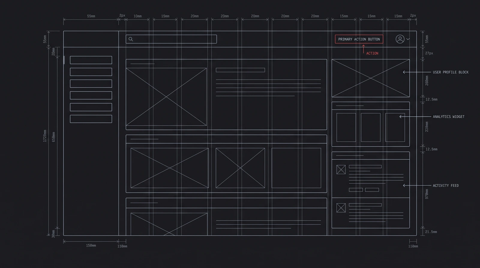
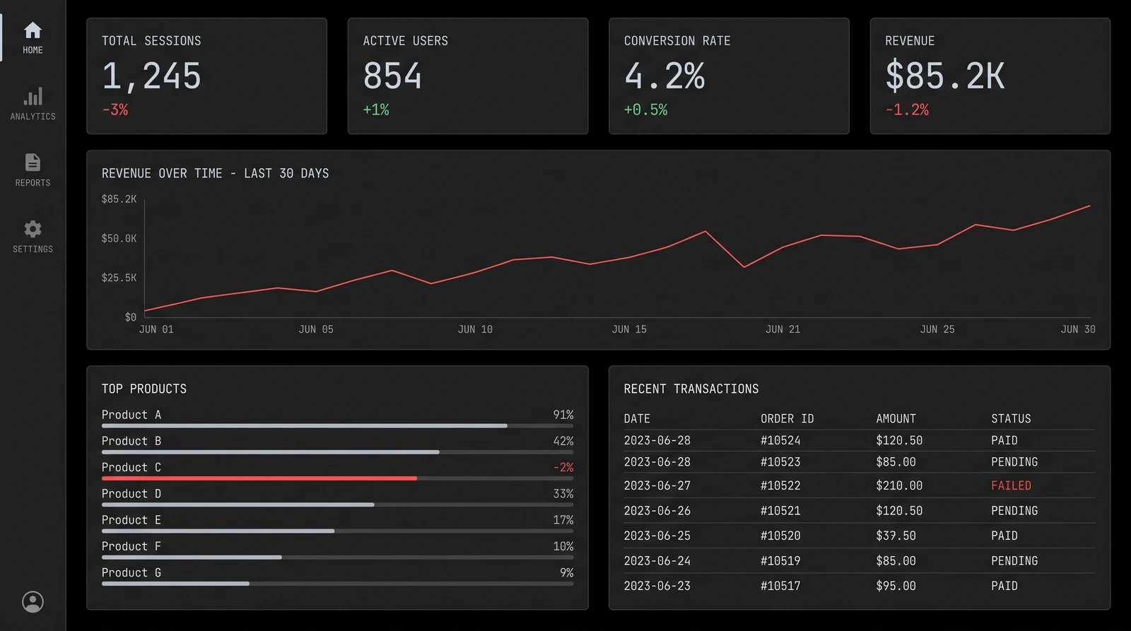
Every build starts as a drawing. The wireframe settles structure while changing it still costs nothing, and the interface concepts show the finish a real product gets from me. Both are generated demonstrations of the register, drawn in the same design language as this site, and neither belongs to a client.
The wireframe is the cheap argument. It settles the information hierarchy, the navigation, and what the first screen owes its user while a change is still a redrawn line instead of a rebuilt component. I draw one for every build before any code exists, and clients mark it up the way they would a floor plan.
The dashboard concept shows where that drawing ends up: dense numbers held readable by hierarchy, a single accent doing all of the signaling, and charts that answer a question instead of decorating a panel. It is the discipline this site runs on, pointed at a product.
- Structure approved on paper before a pixel is spent
- One accent color, and it only ever means something
- Numbers in a mono face, aligned so they can be compared
Mobile
The same bar, held at phone scale.
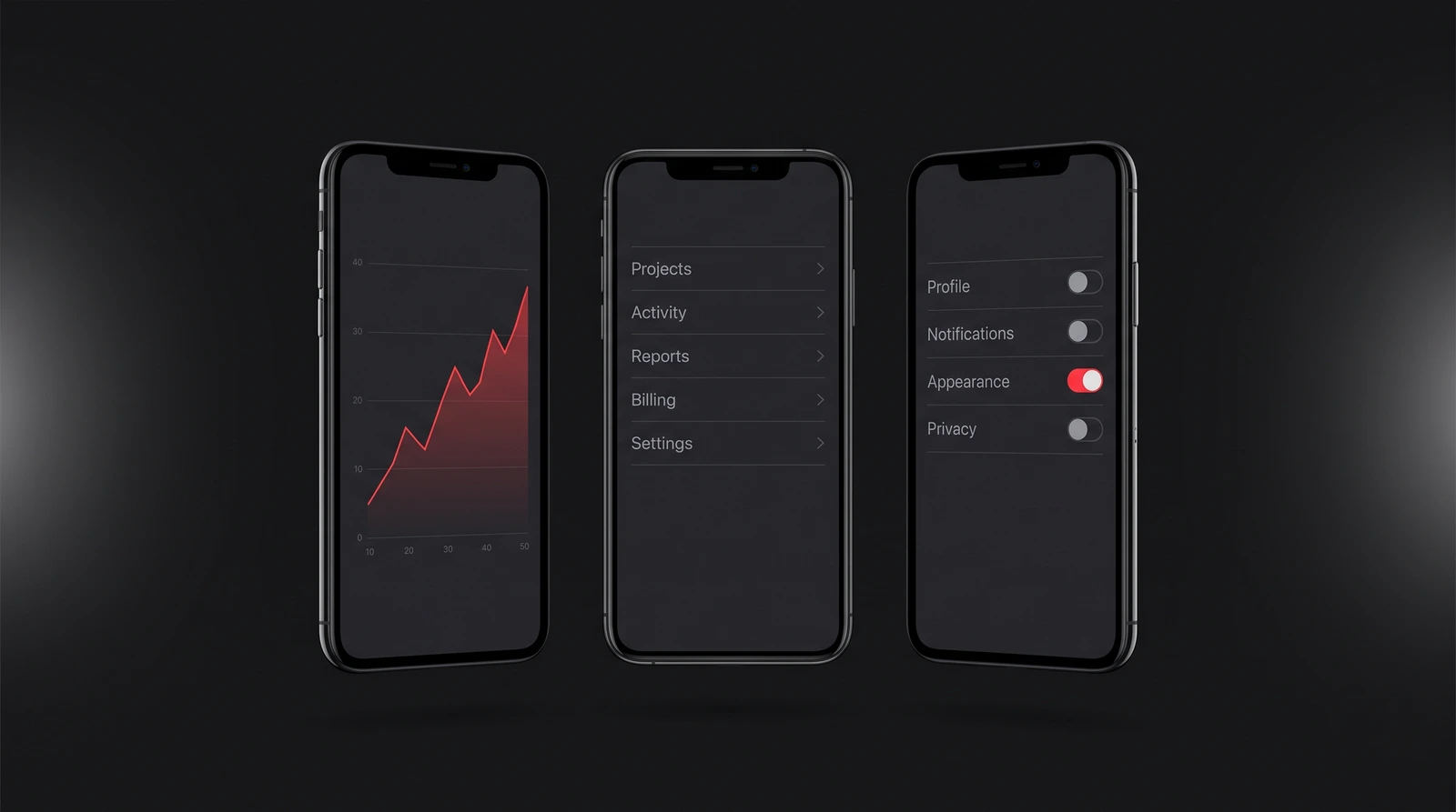
Chart, list, settings: the three screens every product app earns or does not. The concept holds the register of the dashboard beside it, at the size a thumb actually uses.
A phone screen has no room to hide a weak hierarchy. Every list has to earn its order, every action has to sit where a thumb already rests, and dark mode has to be designed rather than inverted.
These three screens are the skeleton of most product apps I get asked about: a reading screen for the numbers, a list that takes you somewhere, and settings that respect you. The concept holds each one at the fidelity an app store listing demands, because that is the surface a real app is judged on first.
Spaces and buildings
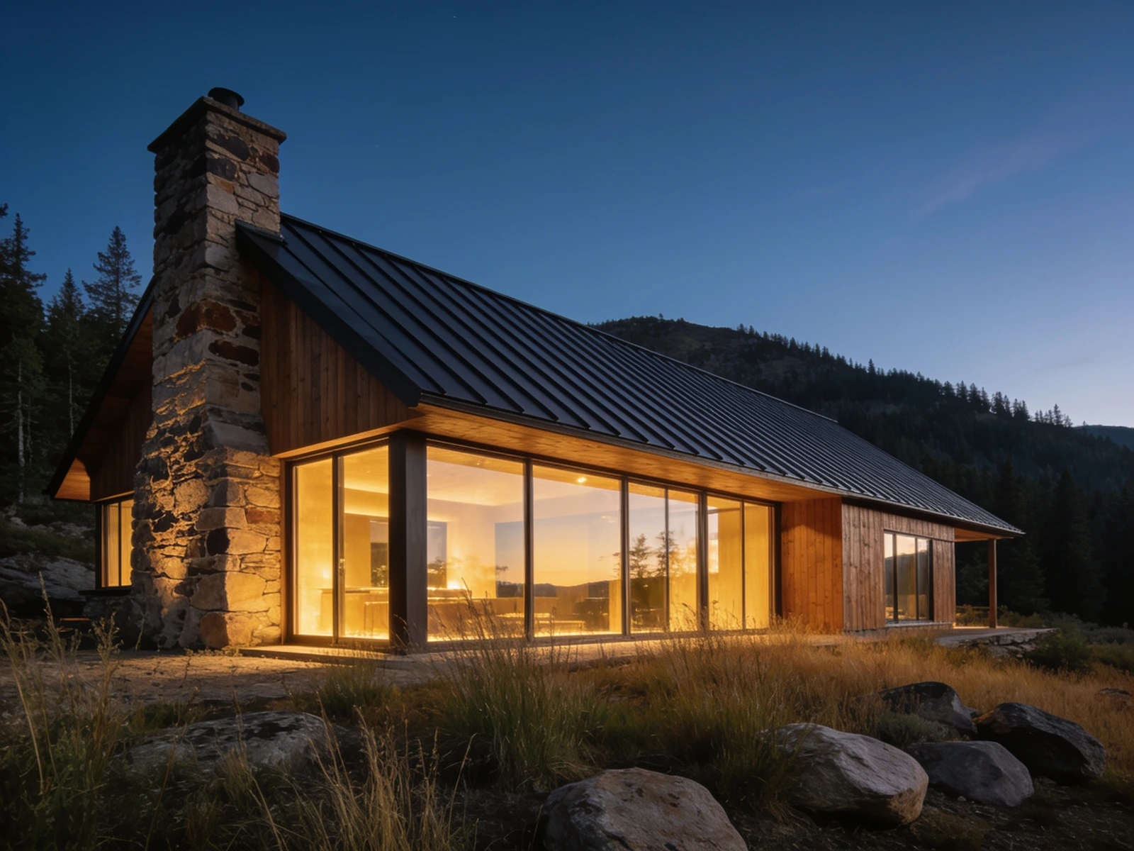
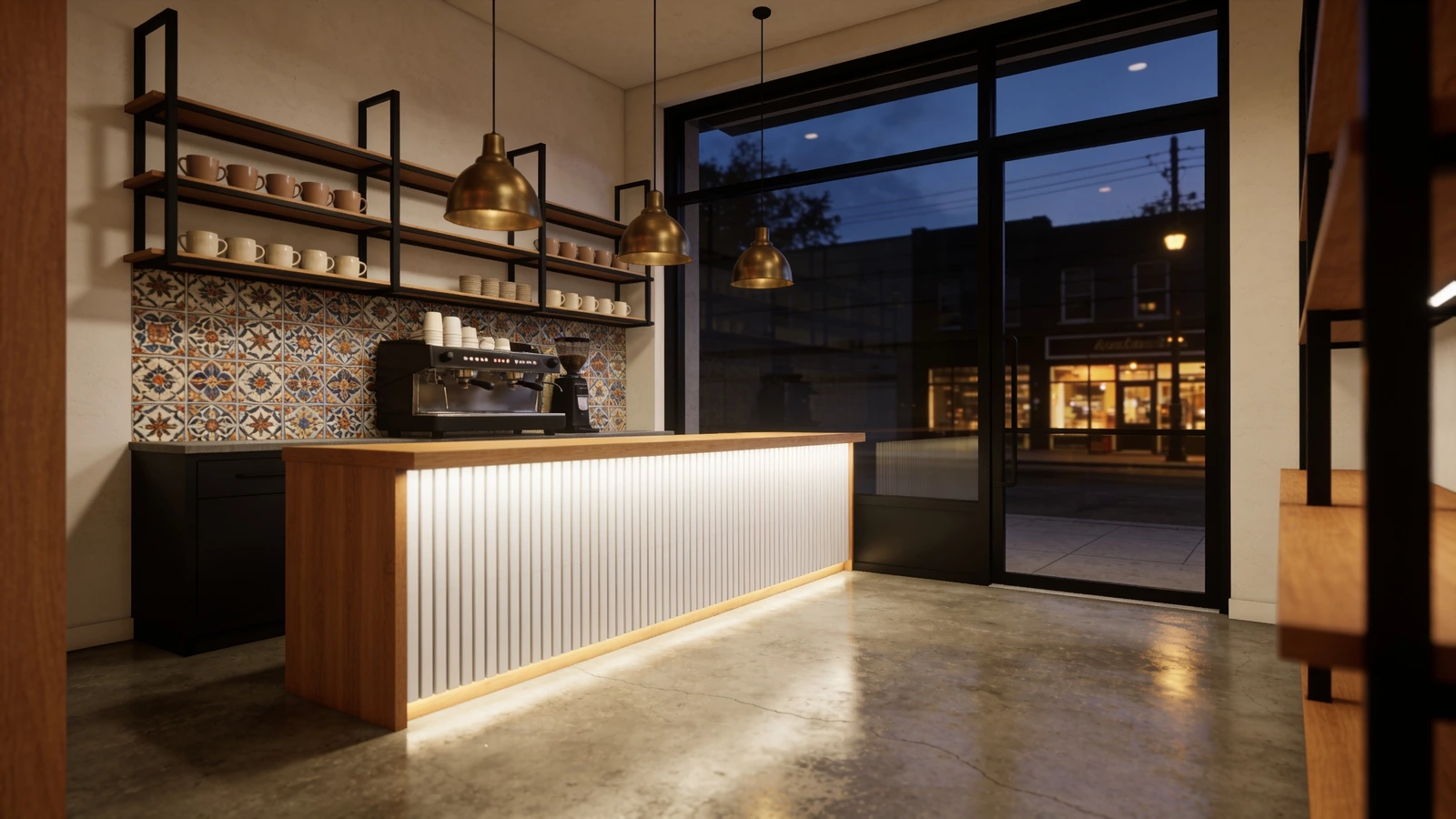
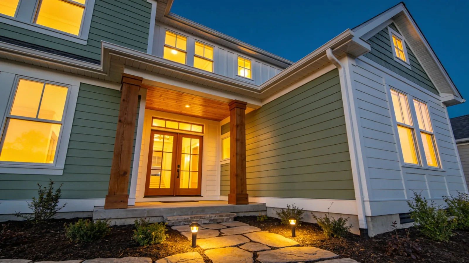
A room a client can approve before a wall moves.
This is the renderings service doing its actual job: the plan made visible while changing it is still cheap. The walkthrough is the same picture a builder signs off on, set moving at eye level.
The client sends photos of the space as it stands and the plan as it exists, even when the plan is a paint chip and a sentence. I render the decision, they mark it up, and the room only gets built once.
The walkthrough exists because a still can be argued with. Motion settles how a space actually meets you at the door, and frame one of the film is the same picture the client approved, so the moving version cannot quietly promise something the still did not.
Brand motion
A mark that moves is a brand with a pulse.
The delivered piece leads this page, so this block carries the concept spots: what a launch moment looks like before a real mark is in it.
A concept spot is art direction you can watch: the light, the pacing, and the landing of a mark, staged on a placeholder so no real brand gets borrowed for a demonstration.
On a real engagement this becomes the piece at the top of the page: your actual mark, animated on purpose, mastered for each place it runs, with the source files handed over at the end.
What lands here
When a case study goes up it will carry the problem in the client's words, what I did and why I picked it over the alternative, the numbers on both sides of the change, and what I would do differently now.
Nothing on this page will be generated, reconstructed from memory, or rounded in my favor. If a number appears here, I measured it.
What you can check today
This site. It is built the way I build client work: server rendered by default, an explicit caching model rather than an accidental one, a design token system with contrast gates that fail CI, and nothing in the bundle that is not earning its place.
Every number on it comes from the thing it describes. The framework versions in the footer are read out of the project manifest instead of typed into the page, and every price on the site is rendered from one module, so a stale number cannot survive in a corner of it.
You need proof about your project, not about someone else's.
Tell me what you are trying to build and I will walk you through the closest thing I have done, in specifics, including the parts that went badly.